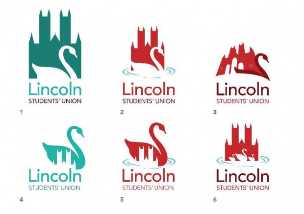
The University of Lincoln Students’ Union has unveiled six potential logo designs.
Posting on their Facebook page on Wednesday, April 17th, 2013, the designs incorporate a swan and Lincoln Cathedral – both of which are iconic to the city.
However, despite offering six designs to choose from, they have generally been poorly received by students.
Thomas Mulholland said: “They’re all weak and do not represent the spirit of the students that attend the university. I get where you guys are coming from with them, but we aren’t all exactly upper class, graceful aristocrats who have tea parties with swans.”
Connor Burton suggested that the SU hold a competition to design a new logo: We have hundreds of students that would be capable of designing this. Could we not have a competition where all entrants are uploaded onto the SU website and we have a vote across the university?”
Mike James Hansford, who is studying International Business Management and French, said: “I’d pick #2 for the record. Though it’s interesting to note that, despite the university’s colours being blue and white and the SU doesn’t feel inclined to make that an option?”
BA Media Production Rachael Carter suggested that Lincoln SU “have a look around other SU logos/websites, be a little more creative”.
She continued: “It doesn’t have to have a representation of the city itself if you come up with something individual to the Students’ Union. Ok, we’re in Lincoln, but is that what the Students’ Union is about?”
What do you think of the logo designs? Let us know in the comments below.


